
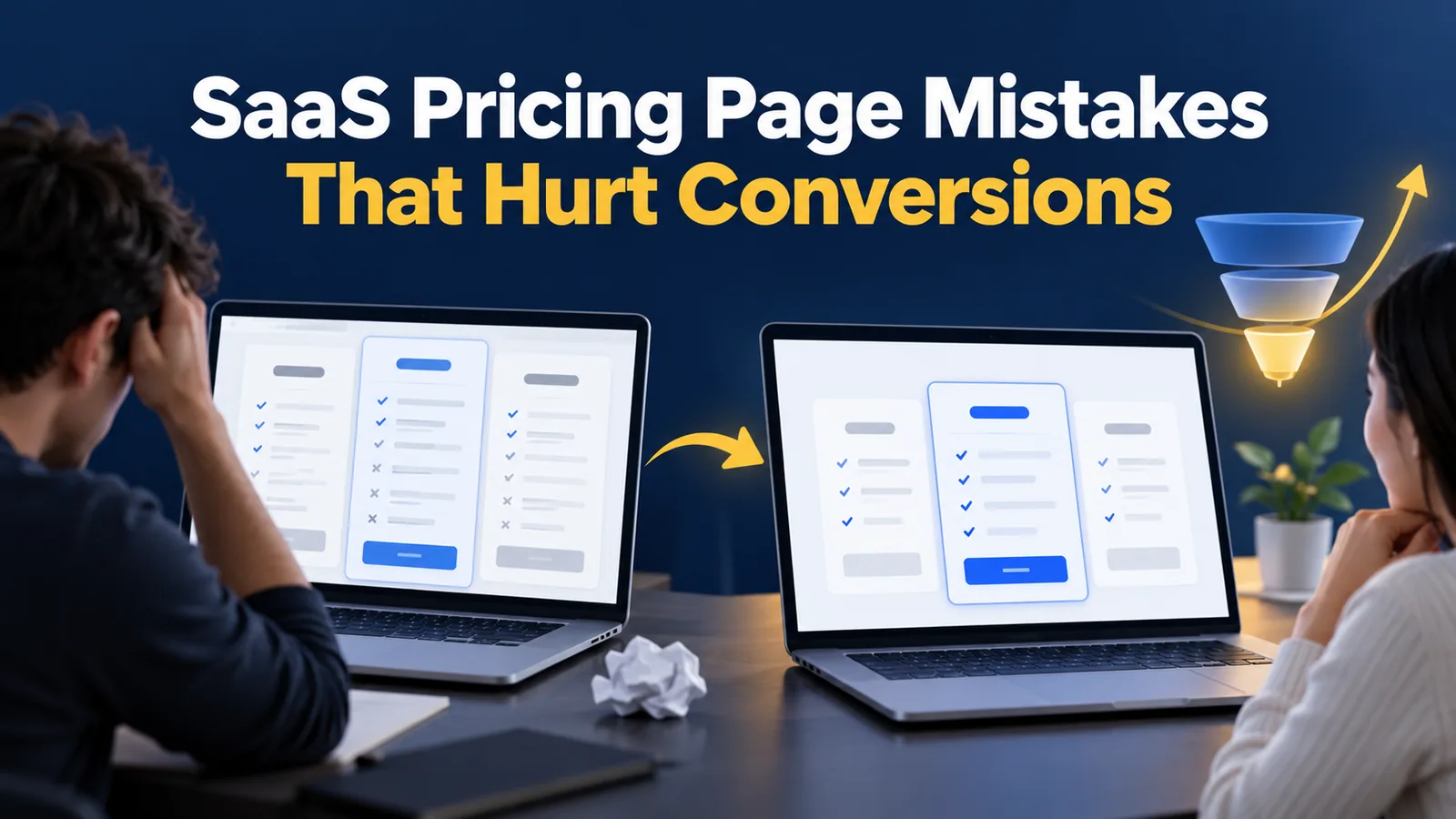
Monetizely’s May 2025 article on bad pricing page UX cites ProfitWell as saying the pricing page gets 14 to 25 percent of total website visitors, who have higher purchase intent. If that is right, a SaaS pricing page is one of the highest-stakes pages you own, and small mistakes there cost real revenue.
This guide covers the most common SaaS pricing page mistakes, what a fix looks like for each and a checklist for your own page. It draws on Monetizely. Monetizely is a pricing consultancy and does not link to the original studies or give their dates or sample sizes, so verify any figure against its source before you rely on it.
Why the SaaS Pricing Page Matters So Much
Visitors who reach your pricing page are close to a decision. Monetizely, citing ProfitWell, puts pricing page visits at 14 to 25 percent of total website traffic, and says those visitors have higher purchase intent.
That makes the page a place to remove doubt, not add it. Before you redesign it, look at what your numbers say. Our guide to SaaS metrics such as MRR, ARR, LTV and CAC helps you measure the effect of any change.
Five SaaS Pricing Page Mistakes
Monetizely names four main mistakes. We add a fifth, testing, which is the habit that prevents the others. Use the table to audit your own page.
| Mistake | What Monetizely says | Fix |
|---|---|---|
| Too many tiers and features | Conversion drops an average of 13 percent with more than four tiers (CXL Institute) | Limit to three or four clear tiers |
| Unclear value between tiers | Clear differences see 30 percent higher conversion (Price Intelligently) | Name who each tier is for and what changes |
| Hidden pricing and Contact Sales | 75 percent of B2B buyers prefer self-serve (HubSpot) | Show prices, or at least ranges, publicly |
| Mobile-unfriendly tables | A mobile-responsive table raised mobile conversion by 19 percent at one mid-market SaaS company (ConversionXL case study) | Test the page on phones |
| No testing | Not covered by Monetizely; our addition | Run A/B tests on one change at a time |
Treat the figures as claims from third-party sources reported by a consultancy, and confirm them before you quote them.
Mistake 1: Too Many Tiers and Too Many Features
A long feature list makes buyers compare instead of choose. Monetizely says conversion falls by an average of 13 percent when there are more than four tiers, citing CXL Institute, and points to Salesforce as an example of complex pricing that needs sales conversations.
A cleaner approach is three tiers with a short list of the differences that matter, and a full feature comparison below for those who want it.
Mistake 2: Tiers That Do Not Explain Who They Are For
Monetizely, citing Price Intelligently, says SaaS companies that explain value differences clearly see 30 percent higher conversion than those with ambiguous distinctions. Describe each tier by the customer it suits, such as a solo founder, a growing team or a large company, and by the outcome it delivers.
| Weak tier description | Stronger description |
|---|---|
| Pro plan: 50 features | Pro: for growing teams that need shared reports and priority support |
| Business plan: more storage | Business: for teams that need approvals, audit logs and single sign-on |
| Basic: limited features | Starter: for one person testing the product |
Mistake 3: Hiding the Price Behind Contact Sales
Monetizely, citing HubSpot, says 75 percent of B2B buyers prefer to self-serve rather than talk to sales. It adds that Atlassian’s move to transparent pricing reportedly led to a 25 percent increase in qualified leads, but gives no source for that number, so we do not rely on it.
If you need custom pricing for large buyers, still show prices for the standard tiers, and keep Contact Sales for enterprise. Our guide to the B2B SaaS sales process explains how pricing fits the rest of the funnel.
Mistake 4: Pricing Tables That Break on Mobile
Monetizely cites a ConversionXL case study, with the company unnamed, in which mobile-responsive pricing tables raised mobile conversion by 19 percent. Test your pricing page on a phone. Check that tier names, prices and the main button are visible without sideways scrolling.
Keep the buy button visible on every tier, and avoid making visitors scroll through a long list of features before they can find it.
A Pricing Page Checklist and a Testing Plan
Make one change at a time and measure it against a baseline. Use the checklist below.
| Check | Yes or no |
|---|---|
| No more than four tiers? | Test |
| Each tier says who it is for? | Test |
| Prices visible for standard plans? | Test |
| Works well on a phone? | Test |
| One clear main button per tier? | Test |
| Answers to billing questions on the page? | Test |
Link your pricing changes to retention too. Our guide to SaaS churn rate explains why a plan that converts well but churns quickly is not a win.